Expedia Activities Landing pages v1
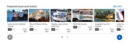
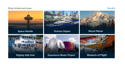
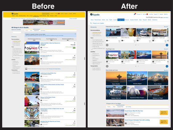
My Role I was one of three designers that built the first version of the new local activity landing page. I was tasked with designing the featured tours and tickets section as well as the shop tickets and tours section.
UX tools Sketch // Zeplin
Duration 3 weeks
Problem Expedia’s local activities page, where users land to book fun and exciting things to do, lacked a true POI (Points Of Interest) landing page experience. When the user makes an SEM (Search Engine Marketing) Google search for a specific POI or activity, they land on a general search results page for that specific area rather than a return of their original search term. This lead to friction as users expect to see the results from the SEM search.
Solution The Local Experts POI landing pages were created to allow the user to come from an SEM search to land on a specific POI page that would curate activities that surfaced at the top of the page. Using keywords in our descriptions and activities, the user would see the activities that they were interested in at the top of the search results.
Mocks and wireframes
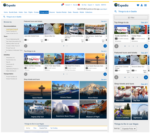
Final v1 screens
What we learned
Next steps
- We learned that the activity page was insufficient and did not help the user narrow choices or guide them to a specific activity that they had searched for.
- While the carousels helped to cut down on verticality, they did not allow users to compare.
- We need to have better success metrics than just move fast. By bypassing the discovery phase, there were no fall back options to test changes that might help increase traffic.
- When building a new page, we needed to make sure we knew how the traffic would get to the proper search results.
Next steps
- Create a POI specific landing page that would pull in activities that were relevant to the point of interest.
- Show case pages with a large hero image to reinforce that the user is on the best page to find a specific activity they had searched for.
- Create a frictionless experience to allow activities to ”bubble to the top” of the search results on a POI page.
Local Activities POI Landing page v2.0
My Role I was the lead designer on the second phase of the POI landing page experience. Worked closely with the Product and Developer team.
UX tools Sketch // Zeplin
Duration 3 months
Problem We now knew, from our launch and testing of the first iteration of the landing pages, that the user wanted to see the activity or experience they had searched for. Users didn’t want to sift through a long search results page. Users wanted to feel secure in knowing that they had landed on a POI page that interests them.
Solution The POI landing page, with the help of a large hero image and large title, would reinforce the user that they were getting the correct terms that they had searched for cutting confusion and frustration. Today, when a traveler searches for ‘tickets to [activity]” we send them to an info site page for a specific activity. That means they’re not being exposed to the wide variety of options we have for experiencing a POI. The goal of this page is to expose the user to all activity options for a POI.
